
The state of Florida, every four years, is a definitive swing state in the US Presidential election. Since 1996 – 5 election cycles ago – the candidate that captured Florida’s electoral votes became the next US President. Assuming a strong correlation between campaign contributions and election results and having perfect hindsight of knowing the 2012 Presidential election outcome, analyzing campaign contributions data can help us put these results into context.
In Florida, which candidates received the most dollars and from how many people? Which is a better indicator for race position? Are there distinct characteristics in the data between Republican contributors, Democratic contributors.. and other party contributors? Is the total campaign donation as important as number of contributors and/or amount per contributor? And so on…
I conducted this analysis as part of Udacity’s Data Analysis with R and my full code can be found here. The remainder of this post is an overview of the most interesting findings.
Data Overview
Data source here. Roughly 361K contributions starting 1.8 years prior to election date and processing payments up to a month after. 14 total candidates (1 Democrat). 1,468 zip codes after some minor cleaning and around 12,600 unique occupations telling us that the occupation data is a disaster (US BLS tracks 800 jobs across the US). Most frequent contribution amount is $100. Now let’s go a bit deeper…
1. Contribution # > Contribution $
While total Republican contribution dollars trumped those of Democrats by a factor of nearly 3 ($65M to Repubs and $23M to Dems), total # of Democrat contributions outpaced the Republican count 1.5x (210K to 145K). This tells me there was broad Democrat support in FL in 2012. Plotting the cumulative contribution dollars over the course of the campaign cycle shows Mitt Romney as the powerhouse player.

But, if we do the same thing for cumulative # of contributions the front runner of the race and eventual President elect pulls ahead.

No matter how much money an individual has, when they enter the ballot booth their vote is just as important as the next person. The importance of broad support is clear in this case. When FEC contribution data is released later this month (October 2015), maybe we will see a similar patter emerge in the state of Florida.
2. Contribution Size Matters
If Republicans raised more total dollars with fewer contributions than Democrats, it must be true that the average Republican contribution was larger. The median Republican contribution was $100 vs. Democrats $35. That’s a statistically significant difference using the wilcox.test in R! Practically significant in real life too 🙂 An overlay histogram displays this nicely with a blue line representing the Democrat median and a red line representing Republican median.

3. Cities Lean Democrat
To some, this is conventional wisdom, but it’s always nice to see another map. The map below leverages google maps combined with ggplot2 graphing library. I’ve divided each zip code between Barack Obama and Mitt Romney based on # of contributions coming from that zip. On the map, if >50% of contributions went to Barack Obama, the zip code is blue. If >50% of contributions went to Mitt Romney, the zip code is red. As you can see, some zip codes have no contributions (or at least no contribution data).
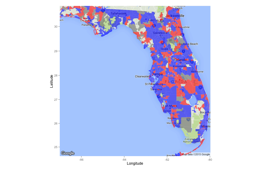
The major cities – including Miami, St. Petersburg/Tampa, and Orlando – are heavy blue. Overall, consistent with findings about Barack Obama getting the greater share of contributions, the state is painted not red… but blue.
Conclusion
Florida contribution data in 2012 seemed to point us to the election results. However, there is a lot more that might be done. We would want to find similar results going back many Presidential elections and not just 2012. Perhaps 2012 was an anomoly? Another important investigation would involve looking at this data nationwide… at least in the other typical swing states. Do the same findings hold true? Unfortunately, this is only one state and one state in one election cycle does not make a pattern.